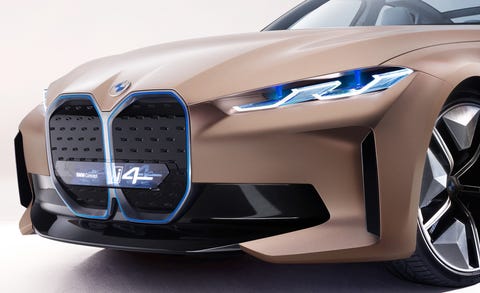
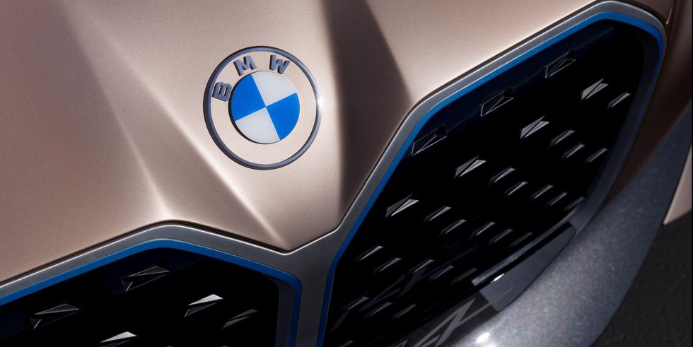
For the first time that we can recall, BMW is redesigning its logo, the famous roundel.
While the circular shape and basic architecture are the same, the middle still has the blue and white colors of the Bavarian state from which BMW hails.
Yes, we’re aware that the blue and white is often thought to be a spinning propeller, to honour BMW’s aircraft-engine beginnings, but BMW historians and the public relations department agree that the blue and white is a tribute to Bavaria.
What’s new is the retro font that spells out BMW, and that the outer circle is no longer white but clear. So the new badge will take on a different appearance depending on what color of car it’s on.
When it’s stuck to a car, the logo looks entirely new, as the outer section will take on the car’s color. Of course, if it’s on a white car it will look like the classic badge, but even then, the new font gives it a new and different appearance.

We really like the new look. It modernizes the emblem while acknowledging the 103-year history of the brand.


